

I’m often asked about climate data. Is there a set of facts that will help someone better understand the climate crisis when they’re in a conversation about it with a friend or even a denier? Is there a simple and visual way to understand the current status? Is there any hopeful data?

After a lot of research, I’ve found Our World in Data to be one of the best climate data sources. Their data is easy to understand, comprehensive, and insightful. This month, I’m including a few of my favorite charts focused on fossil fuel usage. I encourage folks to check out all of their data at www.ourworldindata.org.
The first chart looks at carbon dioxide emissions by fuel or industry type. What’s clear here is that humanity has yet to reach peak carbon dioxide emissions, never mind start the much-needed descent toward the 2050 zero emissions goal. That said, most experts expect peak emissions to happen sometime during the next five years. It’s also worth noting that coal emissions have been essentially flat for the last couple of years, in part as a result of the reduction in coal plants in the United States, a trend that will continue. Still, we have a long way to go if we collectively decide to meet the 2050 goal.
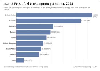
The second chart shows fossil fuel consumption per capita. What’s important in this data is the fact that the U.S. uses more fossil fuels per person than any other country in the world. When you couple this information with the fact that the U.S. has emitted about 25% of all the carbon emissions since the start of the Industrial Revolution, it’s clear that we own a large part of the problem even though we’re only 4.23% of the population. That’s because carbon stays in the atmosphere for a very long time, between 300 and 1,000 years. Stated differently, once someone emits carbon dioxide, it’s in the atmosphere for multiple generations.
Plus, the urgency to move to zero emissions is multiplied by the fact that the rest of the world will need more power in the future, and we’ll probably use more as well. The only way to do so and, at the same time, guarantee a viable future for our children, is to replace fossil fuel consumption with sustainable consumption.
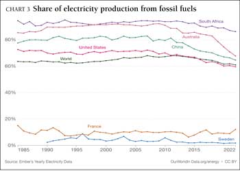
The third chart shows the share of electricity production from fossil fuels. The first thing that stands out from this chart is that most of the world is producing most of its electricity using fossil fuels. There are a few countries, like Sweden and France, that have almost entirely moved away from fossil fuels, but it’s the exception and not the rule. Still, that’s good news and shows it’s possible. There’s also some good news here from a U.S. perspective. The U.S. is producing more and more electricity from sustainable sources, with states like Texas and California leading the way. As a result, we’re down to about 60% of all electricity production using fossil fuels as a primary energy source though we are far from what France and Sweden are doing in terms of deploying renewable energy sources like solar and wind. That said, in this area, at least, I’m confident we will get there in time.
In summary, I’ve shared only a few of my favorite climate charts on fossil fuel consumption. They do an excellent job of giving folks a feel for the world’s current usage trends and show the difficult road ahead in the push toward zero emissions. I hope they become some of your favorite charts as well.
Next month, I’ll write about the pope and climate change.
Rich Marcello is a novelist and a member of the Climate Initiative Committee. In writing his latest novel, “The Means of Keeping,” he spent several years researching the climate crisis.